Appy is a concierge service/app that affords those visiting Portugal the capability of city exploration with a seamless experience. Appy allows for booking and saving activities, booking a cab in advance to pick and drop you at your destinations. Appy wants to surface the city activities from a local perspective and embrace the Portuguese culture.
Project: Appy
Role: UX, UI & Brand Designer
Date: 2020 - 2021
Client: Neomarca
Brief info: Mobile App Design, UX, UI & Brand Designer
Jump to parts on the page

The Brief
Understanding the user demographics
User personas who might use Appy
User research
Competitor research
Event and activities index
Segmented by themes
Date and time
City
Book and save events
Save to collections for later
Book for a certain time and date
See available dates
Book a ride
Select a cab pickup location and drop off
Book in advance
Select number of seats
Branding
App name
Fonts
Colours
Tone of voice
Patterns and elements
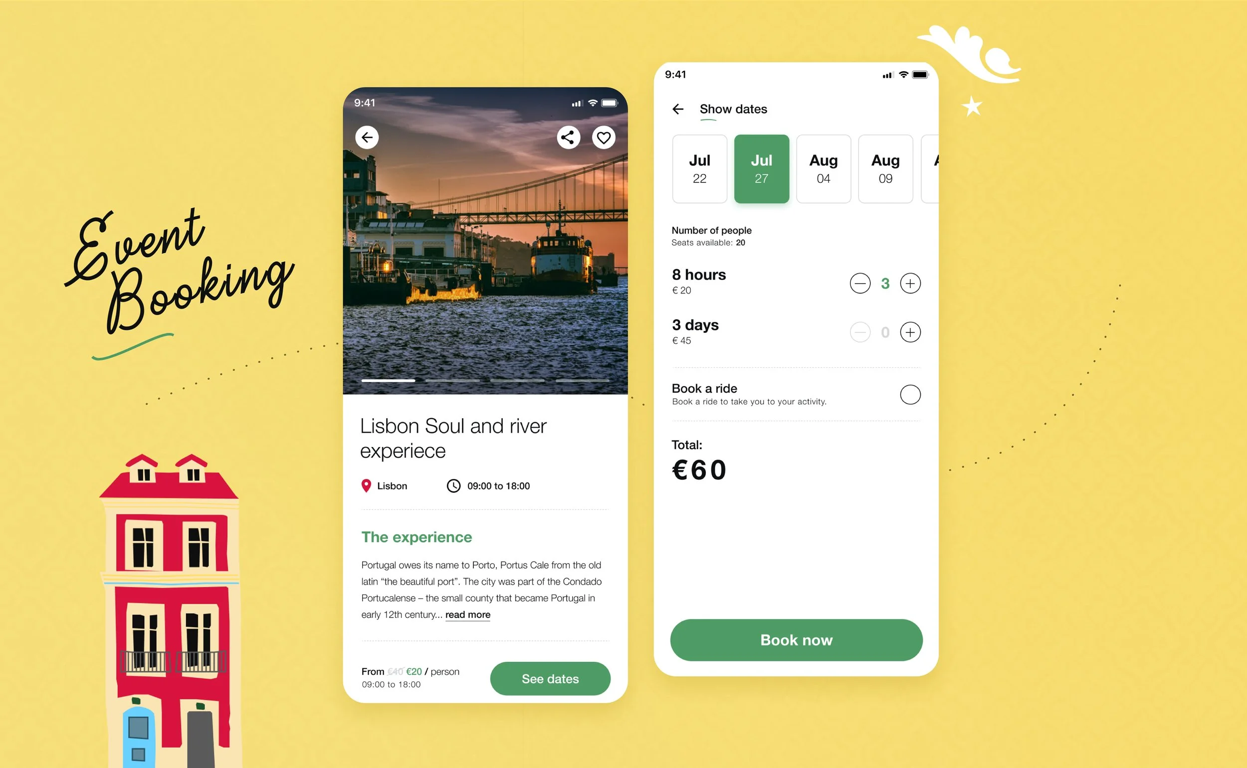
Event Bookings
The Goals
Designing an intuitive process for booking events through a one-stop-shop digital product required research of existing products and understanding the customer demographics in more detail. Neomarca wanted to populate a screen with a range of different activities for individuals or groups to engage with based on; location, date, time and theme.
We established the importance of having a quick search option alongside carousels split into themes (see image at top of the page).
After a user selects an activity of interest they can save the activity for later, booking it for a certain date and booking a ride to take them to and from the location in which the activity happens.
Font Branding
Every font tells a different story. We wanted to find something that evoked a sense of happiness, playfulness, adventure, and freedom. The original brand name ‘Appy’ selected by Neomarca was named after the word ‘Happy’. The intention was to cheer one up when they used the app to explore and book events.
The Portuguesa Font
After extensive research through branding sessions, the font options were narrowed down to ‘The Portuguesa’ font, which we thought really emphasised the Portuguese typeface style. Neomarca is a Portuguese company and their goal was to surface the local culture through the App for its customers to get a full experience of what it might be like to visit the country.
Pattern Design
The Tiles & Colours
With the goal of portraying an immersive Portuguese sense of local culture, it was important to focus on the smaller aspects of what makes each city so unique to the country. The tile designs are an aspect of the culture that resonates strongly with Portuguese locals so with this, we wanted to explore avenues in which we could include this aspect of culture trickled through the UI and overall branding.
Prototyping
Where It All Started
The Neomarca team was looking for a design that embodied that of the Portuguese culture but didn’t interfere too much with the user interface. By having a better understanding of the customer demographic we could establish how we wanted to approach design. Highly functional was a key aspect that meant less room for bells and whistles alongside fancy animated elements.


