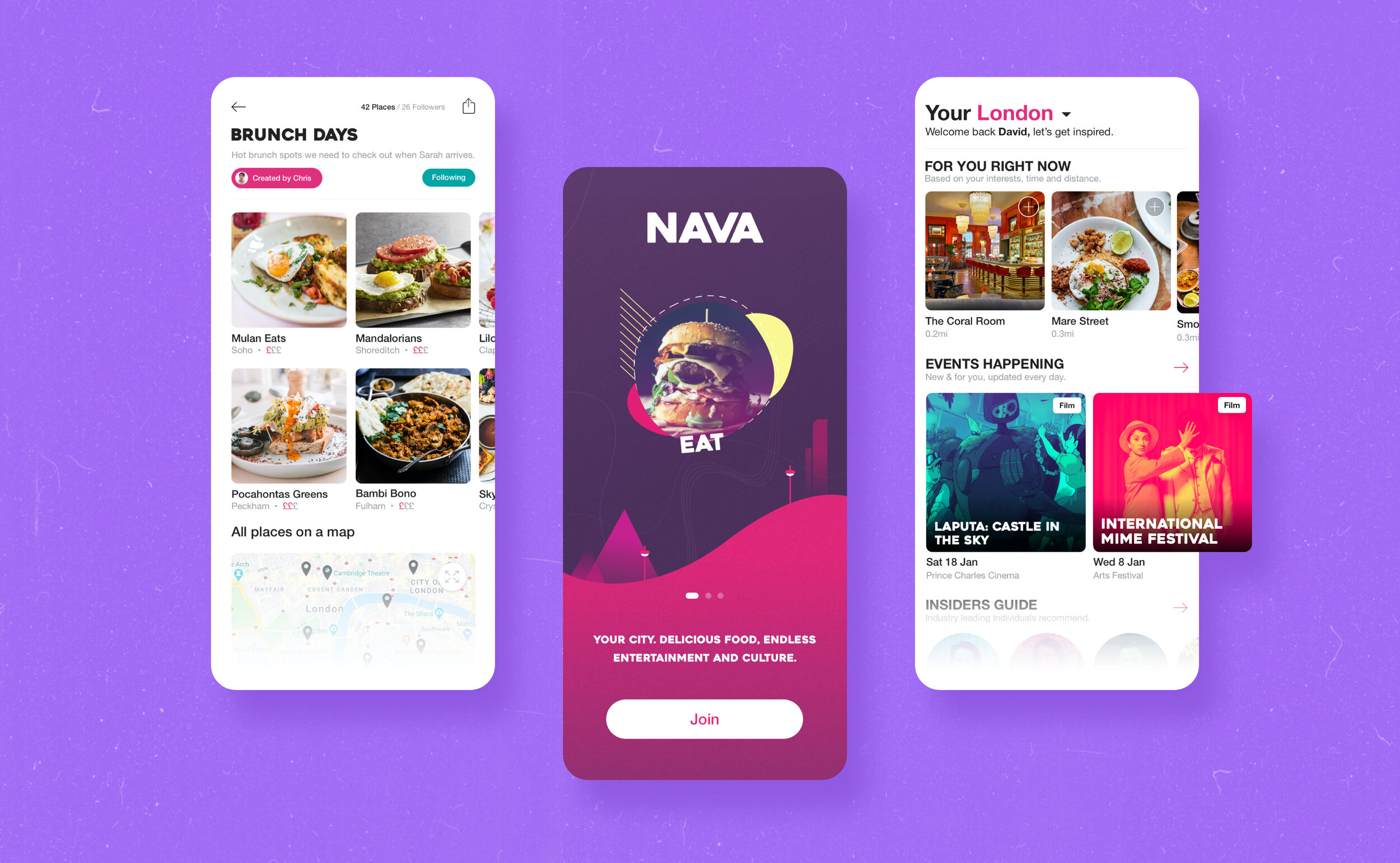
NAVA is the Pinterest of city discovery that focuses on creating immersive city experiences in the UK and Germany. Combining accurate recommendations using machine learning, NAVA is the genuine storybook of experiences, helping locals and travellers alike unlock the city while providing for independent venues, chefs, designers and more.
Project: Nava
Role: Co-Founder, Product & Design
Date: 2016 - 2020
Live Demo: Usenava.com
Brief info: 100k+ users, iOS & Android, React Native, 4 Cities (London biggest), Offices in Hackney, team of 9.
Jump to parts on the page

The Timeline
2016 – Introduction (product cycle)
KOMPAS (Brand name)
User validation
Initial design MVPs
App development
2017 – Introduction & Growth
Funding and team growth
Development team expansion & sprints
Market validation from users
Commercial marketing partnership with London Midlands Railway Service
2018 – Growth
Product iteration with a move towards content
Introduction to collections feature
Collaboration with General Assembly UX team
Joined Founders Factory
2019 – Growth & Maturity
Rebranding to NAVA
Product partnership with easyJet
Content expansion
2020 – Growth & Maturity
Collaboration with General Assembly UX team
Product for venues (B2B model)
Discover Feature -> Home feature
Home Feature
Understanding
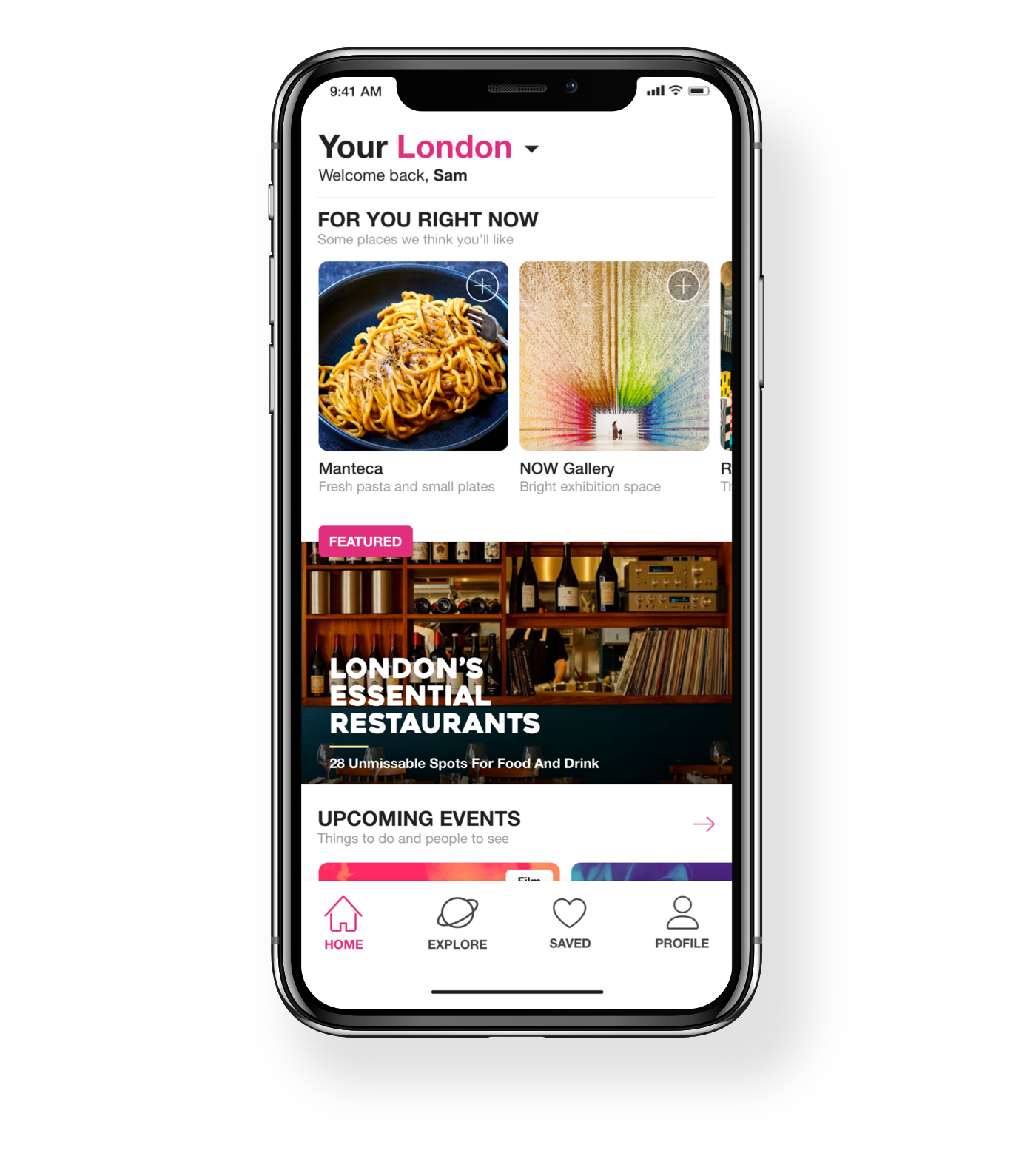
“Well what’s more engaging than just seeing good content? Even more good content” - one of our users made this statement in a feedback session. It became clear we weren’t giving our users the most immersive and valuable experience we could with our previous home feed. We wanted to give users the same feeling as opening a new storybook. Intrinsic behaviours lead by a sense of adventure and inspiration that would result in emotional rewards upon visiting these venues on their next journey.
Designed it
Data, sharpies, sticky notes, paper, feedback all jammed in a 2-week sprint. Our content writers chimed in within the context of the feature suggesting how we could make changes to our custom-built CMS to alleviate any future development resource. This is where could we convey our friendly, helpful, cheeky tone of voice throughout the user experience. Once again we returned to our users and tested our prototypes for feedback on value add and experience.
Shipped it
We launched the new Home feature and instantly saw a rise in engagement on the App. Average user satisfaction also rose from individuals relaying their feedback via a form stating that ‘they would be disappointed if NAVA didn’t exist tomorrow’.
Designed it
“NAVA is a city discovery app, show me a taste of the city, what can I look forward to after joining”? We took to the drawing board loaded with ideas and fueled with a passion for wanting to show the true essence of what the NAVA experience would look like to these new users. We wanted to include photography for connection & inspiration alongside playful short words and insightful sentences.
Shipped it
After receiving feedback on the prototype designs and making appropriate changes we then proceeded to prioritise key elements based on the predicted impact it would have for our users to release in that sprint. Our new onboarding went on to significantly reduce churn with positive user feedback surrounding aesthetics, brand affinity, and insight into the product.
Onboarding
Understanding
We wanted to take the user on an exciting journey that didn’t feel like a task, but more an experience. With data showing a proportion of users churn after downloading NAVA, it was easy to identify a disconnect between expectation and delivery. We spoke to our users and it became more apparent that we were lacking story, character, insight and most importantly, fun.
Explore Feature
Understanding
Before our Home feature and new onboarding materialised into what they are today Kompas (NAVA) was solely a map with place recommendations based on categories; Food, Drinks, Cafes, Culture, Outdoors, Art and Shopping. However with data showing low retention, and user feedback suggesting that there was a lack of inspirational content and that the user experience had no personality we had to make serious changes, and quickly.
Designed it
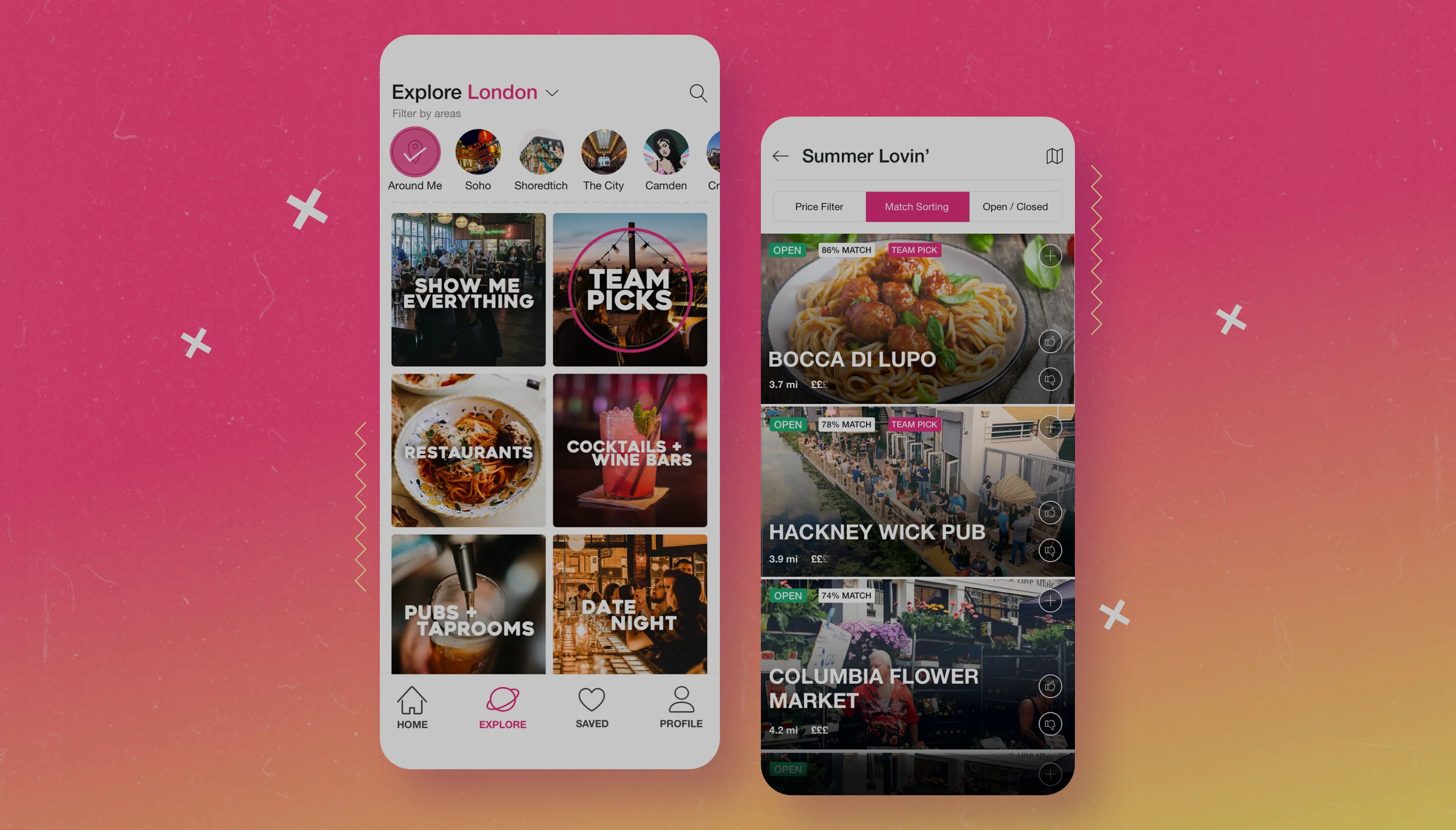
With only a small amount of data to work with and a mere few users willing to provide feedback we had to extract as much information as possible, weigh potential impact versus resource consumption and make executive decisions. We looked at competitors and non-competitors to gauge what other products were doing to create such an intuitive experience. These are our three key use-cases for customers looking to explore a city which was uncovered through our product cycle and how we’ve created a solution for them:
Explore: For customers who want recommendations on where to go right ‘now’
Home: For customers who are browsing inspiration for ‘later’
Collections: For customers who want to store ‘recommendations’ or keep a track record of ‘visited’ places
Shipped it
We built circumstantial themes with a more intuitive UI similar to the Instagram story circle buttons that allowed users to choose a district of the city before selecting a theme. What we saw after releasing the new Explore were very valuable data points in which we could use to improve the product and understand our users on a more granular landscape. The Explore feature was well-received yielding higher weekly retention figures and most of all, helping the individuals discover new exciting places, quicker, easier that were personalised to them.
The Brief
We took a trip to Luton alongside Founders Factory to meet with the easyJet team and pitched two concepts we could build within a sprint. They chose the ‘collections’ concept;
EasyJet provided some high-level data on users segments
NAVA’s content team curated two collections filled with 25+ interesting venues based on demographics and split into categories: Couples, Family Fun, Culture and education, food and more.
Two collections were created for London to Berlin and Berlin to London passengers
Both the collections could only be unlocked and accessed with a secret code
The secret code and NAVA App promotion featured in the inflight easyJet magazine
The pilot campaign ran over 1 month and yielded over 1000+ downloads between both flight paths
NAVA provided aggregated data to easyJet about most viewed venues, visited, favourited, user demographics and more.
The Outcome
“I can probably count on one hand the number of times I’ve seen a company using A.I. in an intelligent contextual way. This is really super. The contextual recommendation stuff is dreamy and seriously useful.”
Feedback from an easyJet customer
Working with such a large organisation gave us immense credibility, a more vast understanding of our users and scope on how we could use this offering as a business offering.
easyJet
Partnership
As one of the partners and investors in Founders Factory, easyJet was exploring how innovative startups could bridge the gap between check-in & check-out. There was a lack of data surrounding the types of venues their customers would engage with upon arrival and during their stay. We knew as a city discovery app that focused its core business model on deep tech and venue exposure would fit the flight company perfectly.
Methods
Methods used throughout sprints, prototyping and the business:
Data extraction from Mixpanel, feedback forms, in-person interviews (offline & online) and campaigns
Speaking with users to understand problems (qualitative & quantitative)
Design studios sessions
Interactive design solutions
Sprint planning
Affinity mapping
Retros
Daily stand-ups
Brand alignment and core value research
